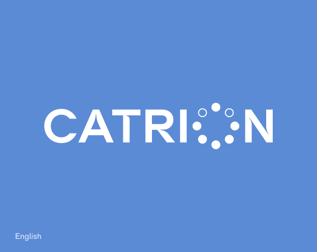
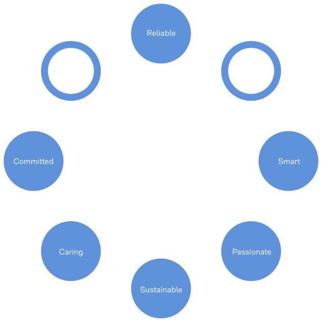
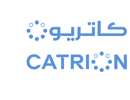
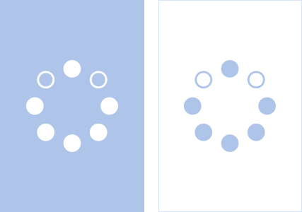
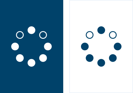
Our brandmark serves as a significant representation of our brand, embodying its principles and essence. It is a symbol that reflects our brand’s core values, with each solid circle within our icon representing one of these values. The name ‘CATRION’ is inspired by ‘catering’ and for a switched ‘on’ brand creating a name that is global, active and engaging.
To maintain its integrity, please use the artworked brandmark at all times.
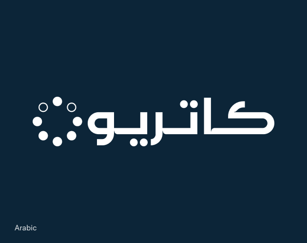
Building the brandmark icon using the brand values, the icon represents the kind of organization CATRION is and depicts what our customers receive. In English, our icon seamlessly integrates with the letter ‘O’ in ‘CATRION’, while in Arabic, the circles combine to form the letter ’ن‘.
Core Values
Primary Colorways
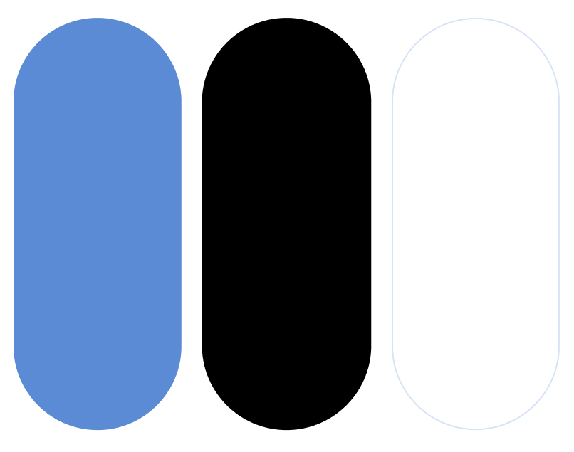
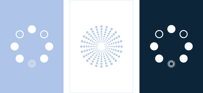
Our brandmark is always primarily portrayed with three colors: our primary sky blue, white and black. The colorways establish how our brandmark must be presented. Please adhere to the following color combinations to maintain the integrity of our brand. Do not use colors not present in the following examples.
1. Pantone 2381 C/U brandmark on white 2. All white brandmark on Pantone 2381 C/U 3. Pantone Black 6 C on white 4. All white brandmark on Pantone Black 6 C
Secondary Colorways
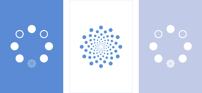
For secondary brandmark usage, our brandmark can be seen in our secondary colors. These colorways establish how our brandmark must be presented on specified collateral approved by the CEO. Please adhere to the following colorways to maintain the integrity of our brand. Do not use colors not present in the following examples.
1. Pantone 539 C/U brandmark on white 2. Pantone 2188 C brandmark on white 3. Pantone 2717 C/U brandmark on white 4. Pantone 657 C/U brandmark on white 5. All white brandmark on Pantone 539 C/U 6. All white brandmark on Pantone 2188 C 7. All white brandmark on Pantone 27127 C/U 8. All white brandmark on Pantone 657 C/U 9. Pantone 2381 C/U brandmark on white 10. Pantone 644 C/U brandmark on white 11. Pantone 2120 C/U brandmark on white 12. Pantone 649 C/U brandmark on white 13. All white brandmark on Pantone 2381 C/U 14. All white brandmark on Pantone 644 C/U 15. All white brandmark on Pantone 2120 C/U 16. All white brandmark on Pantone 649 C/U
Clearspace and
Colorways
Single language brand mark.
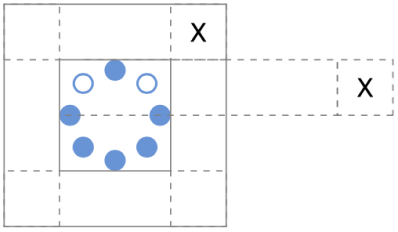
The clearspace is defined by the height of the brandmark icon.
English Brandmark
Arabic Brandmark
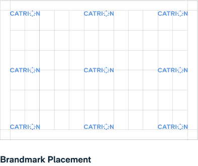
Brand Icon
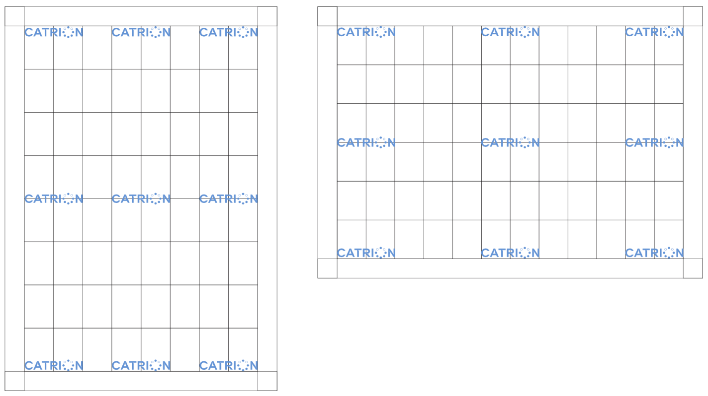
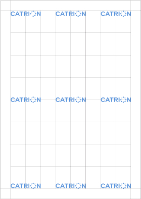
Placement
Our brandmark will be presented in the following positions. Do not place the brandmark in areas not specified in the following examples.
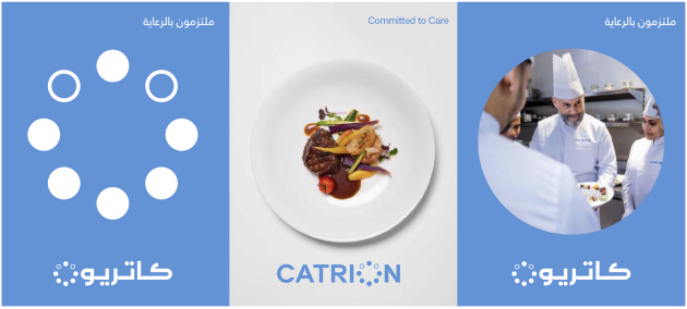
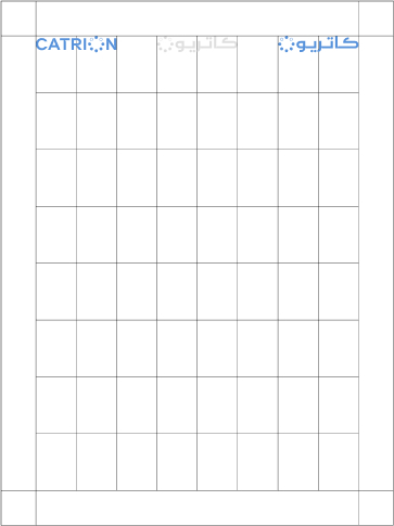
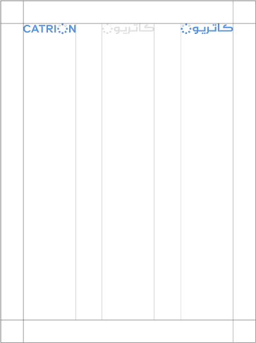
Our brandmark will be seen on the top, bottom and middle of the left, center or right hand side of a composition for both Arabic and English collateral.
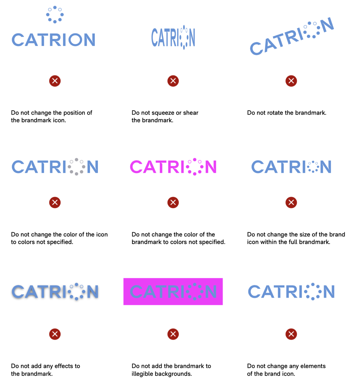
Misuses
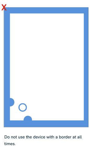
The following misuses describe examples of how our brandmark must not be used. Please adhere to the following rules. Do not change or manipulate the brandmark in any way. To avoid inconsistent reproduction, please use the artworked brandmarks to maintain the integrity of our brand.
English & Arabic
Co-existing Principles 1
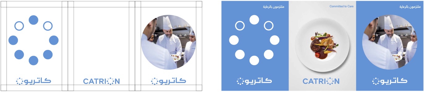
When the English and Arabic brandmarks coexist, they will be placed along the same baseline maintaining the same height of the brand icon. The following examples demonstrate how the brandmarks can coexist in different collateral.
When the English and Arabic brandmarks coexist, they will be placed along the same baseline maintaining the same height of the brand icon. The following examples demonstrate how the brandmarks can coexist in different collateral.
The Arabic and English brandmarks can also coexist in the same composition in different sections. This will be presented through different panels of solid color or photography.
The brandmarks must have the same height measurement to ensure it appears visually balanced. The minimum clearspace is as per the example above.
English & Arabic
Co-existing Principles 2
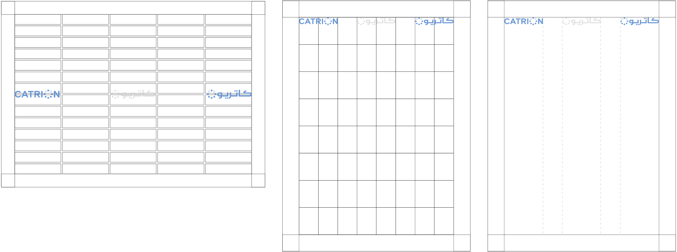
When the English and Arabic brandmarks co-exist on the same line, the placement must ensure that there is equal clearspace for both brandmarks.
The measurement must be equal. This is measured through the placement of a third brandmark in between the English and Arabic where the distance between all marks is equal.
English & Arabic
Lockup Limited Use
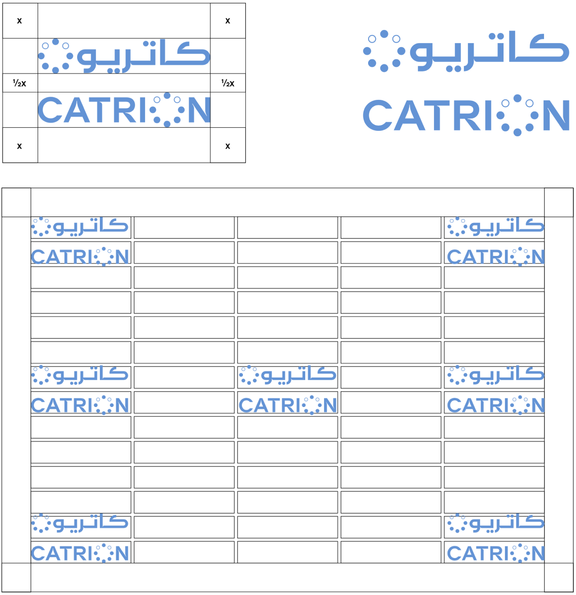
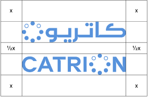
The following example demonstrates how the English and Arabic brandmark will coexist only when the previous co- existing lockup is not possible. The limited use lockup must feature the brandmarks stacked in the following order with a space that is equivalent to half the minimum size marked x. This has been determined to ensure that the marks appear balanced and provide a strong, united impact.
The established lockup will be positioned in the areas provided in the following examples. To maintain the brand’s integrity, please use the artworked brandmarks at all times. The following lockup will be used for limited collateral. selected communications.
For exceptional use only. Use the lockup only for square or narrow formats.
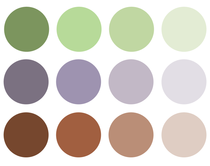
The primary color palette reflects the brand’s vision of reliability, trust and innovation as CATRION grows and propels forward. The selection of blue is refreshing, confident and contemporary allowing the brand to be distinguishable and memorable to a global target audience. Paired with black and white, the combination of colors is vibrant and energetic, creating a modern and sophisticated look and feel.
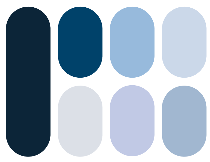
Our secondary color palette captures the essence of Reliable, Smart, Passionate, Sustainable, Caring, and Committed. These colors have been carefully selected to reflect the essence of our brand’s principles, creating a harmonious and meaningful visual representation of our core values supporting the brand’s vivid and characteristic blue. The following includes colors that have not been tested on print. Please ensure to undergo a print test before mass production.
Dark Blue
Pantone 539 C
R: 0 G: 38 B: 58
Coated + Uncoated
C: 100 M: 43 Y: 0 K: 83
#00263A
Sea Blue
Pantone 2188 C
R: 0 G: 66 B: 106
Coated
C: 100 M: 35 Y: 5 K: 55
Uncoated
C: 100 M: 35 Y: 0 K: 50
#00426A
Light Blue (50% Tint of Sky Blue)
Pantone 2717 C/U
R: 167 G: 198 B: 237
Coated + Uncoated
C: 35 M: 10 Y: 0 K: 0
#A7C6ED
Pale Blue (25% Tint of Sky Blue)
Pantone 657 C
R: 219 G: 226 B: 233
Coated + Uncoated
C: 15 M: 5 Y: 0 K: 0
#C8D8EB
Frost
Pantone 649 C/U
R: 200 G: 216 B: 235
Coated + Uncoated
C: 11 M: 3 Y: 0 K: 0
#DBE2E9
Blissful Blue
Pantone 2120 C/U
R: 190 G: 202 B: 233
Coated + Uncoated
C: 23 M: 13 Y: 0 K: 0
#BECAE9
Powder Blue
Pantone 644 C
R: 155 G: 184 B: 211
Coated + Uncoated
C: 38 M: 15 Y: 0 K: 0
#9BB8D3
Tertiary Color Palette
The tertiary colors are provided to expand the brand to include a variety of colors. This is only used to add to the existing use of primary and secondary colors for details such as infographics in PowerPoint or social media assets. The tertiary colors will be used exceptionally. Please note that the tertiary colors must only be used with the CEO’s approval. The following includes colors that have not been tested on print. Please ensure to undergo a print test before mass production.Upon CEO Approval Only
Pistachio
Pantone 366 C/U
R: 173 G: 220 B: 145
Coated
C: 25 M: 0 Y: 55 K: 0
Uncoated
C: 25 M: 0 Y: 50 K: 0
#ADDC91
Lavender
Pantone 666 C/U
R: 161 G: 146 B: 178
Coated + Uncoated
C: 35 M: 35 Y: 5 K: 5
#A192B2
Copper
Pantone 7585 C/U
R: 176 G: 92 B: 55
Coated + Uncoated
C: 4 M: 66 Y: 77 K: 22
#B05C37
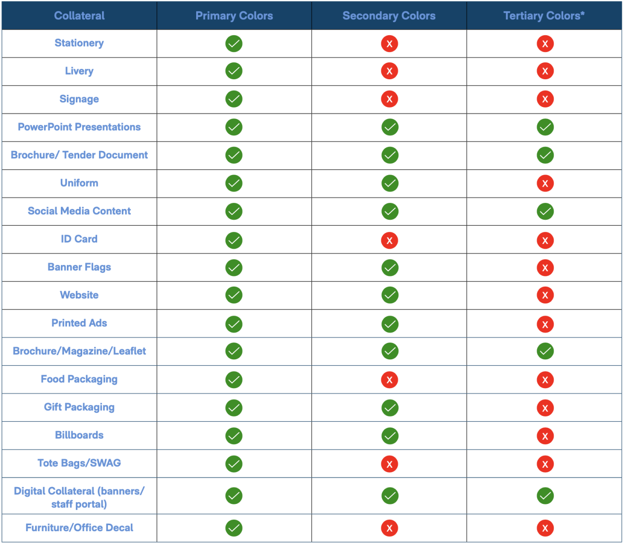
Color Palette
Hierarchy
The selection of colors must appear to have the same tonality to ensure that the palette is balanced and works in harmony with the existing color palette. The secondary colors utilize a diversity of shades and tonalities that highlight the blue of the brand. The tertiary colors give an example of how the brand adopts the same tonality with a different set of colors that depict a new kind of experience. The percentages established in the usage determine the prominence of colors seen across the brand. All collateral with secondary or tertiary colors must be approved by the CEO. The following includes colors that have not been tested on print. Please ensure to undergo a print test before mass production.
Primary Color Palette
0%
The following colors will be used majority of the time. Established as the primary palette, it will be dominantly used across the collateral. This includes assets such as: Printed materials, SWAG, branded content, furniture, details on black or white pages
Secondary Color Palette
0%
When the content requires more diversity of colors, a secondary palette has been created in an addition to the base primary colors. The following colors will only be used to expand on the primary palette in collateral such as PowerPoints (for background colors and graph tables), crafting social media content, working on charts etc.
Tertiary Color Palette
0%
Adopting the same tonality and exploring a new range of colors, the tertiary palette has been developed for the instance where you run out of colors in the primary and secondary selection. These can be used when creating PowerPoints in extensive infographics, crafting social media content, charts etc. Please be mindful of contrast!
Color Palette Usage
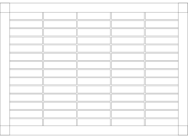
The following table illustrates the range of our primary, secondary and tertiary palettes and specifies which collaterals it will and will not be used in. Please adhere to the table provided and seek approval from the CEO for use of colors beyond the established guide.
The following includes colors that have not been tested on print. Please ensure to undergo a print test before mass production.
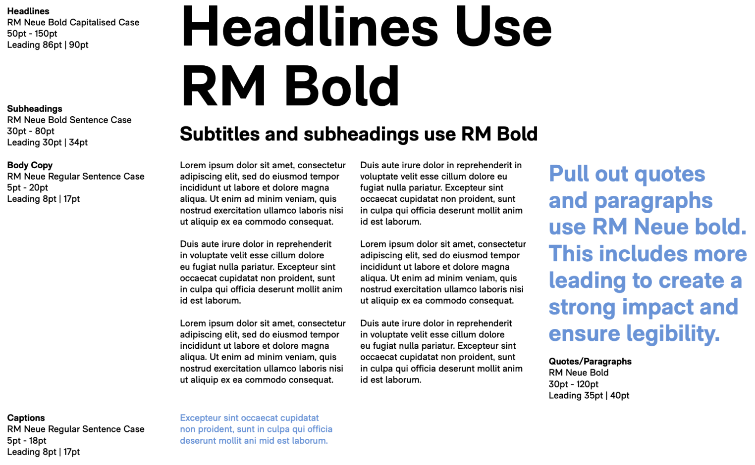
RM Neue is a typeface characterized by its compact proportions and low-contrast design. This combination gives it a sense of instant familiarity while avoiding a sterile appearance often associated with grotesque designs. By striking this balance, our font demonstrates a clear commitment to care, presenting a design that feels approachable and welcoming.
Aa Bb Cc Dd Ee Ff Gg Hh Ii Jj Kk
Ll Mm Nn Oo Pp Qq Rr Ss Tt Uu
Vv Xx Yy Zz
RM Neue Regular
Aa Bb Cc Dd Ee Ff Gg Hh Ii Jj Kk
Ll Mm Nn Oo Pp Qq Rr Ss Tt Uu
Vv Xx Yy Zz
Arabic Font
ا ب ت
ا ب ت
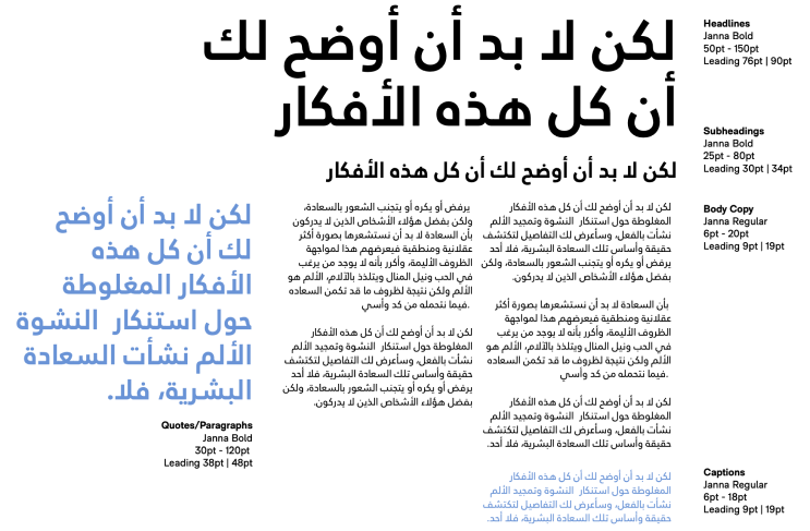
Janna LT is classified as a humanist Kufic typeface, which combines elements of Kufic style with characteristics inspired by handwriting. This unique blend results in a more informal and friendly version of the typically structured and geometric Kufic style. As the counterpart to the English typeface, Janna LT maintains a cohesive aesthetic through its distinctive serifs and welcoming curves. These design features harmoniously reflect the style and sophistication of the English typeface while adding a touch of individuality and approachability.
Janna LTD Bold
ا ب ت ث ج ح خ د ذ ر ز س ش ص ض
ط ظ ع غ ف ق ك ل م ن ه و ي ء
Janna LTD Regular
ا ب ت ث ج ح خ د ذ ر ز س ش ص
ض ط ظ ع غ ف ق ك ل م ن ه و ي ء
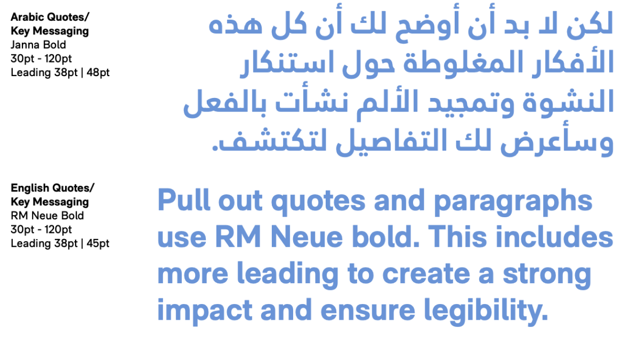
English
Hierarchy & Composition
The hierarchy and composition establishes the relationship of the type in terms of font, font weight, font size, letter case and leading.
Minimum Sizes RM Neue Regular 5pt RM Neue Bold 5pt
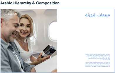
Arabic
Hierarchy & Composition
The hierarchy and composition establishes the relationship of the type in terms of font, font weight, font size, letter case and leading.
Minimum Sizes RM Neue Regular 5pt RM Neue Bold 5pt
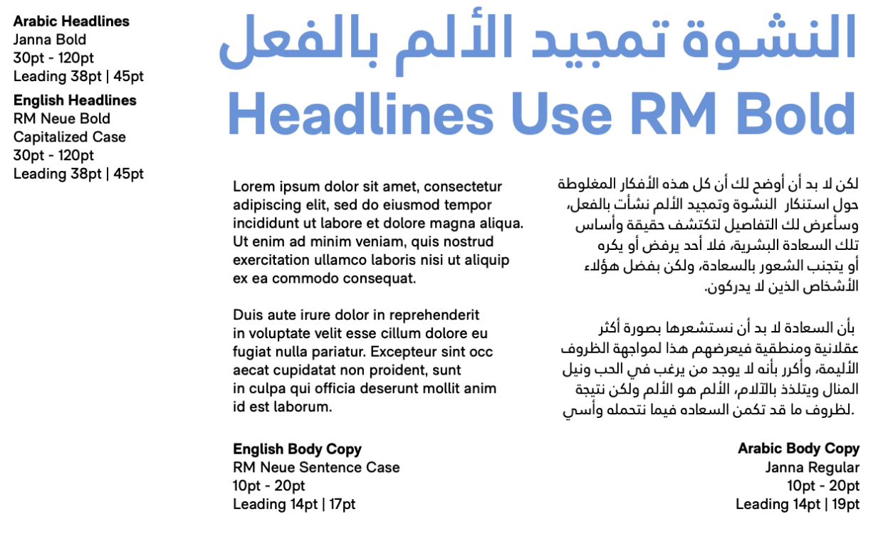
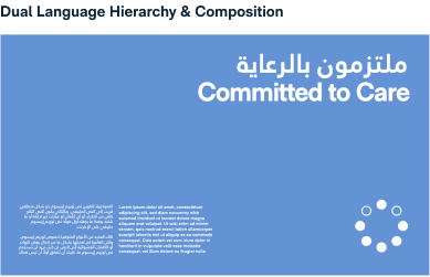
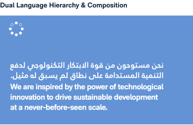
Dual Language
Hierarchy &
Composition
The hierarchy and composition displayed depicts how layouts can accommodate both Arabic and English languages. Ensure that the type appears harmonious and visually similar.
Hierarchy &
Composition
Examples
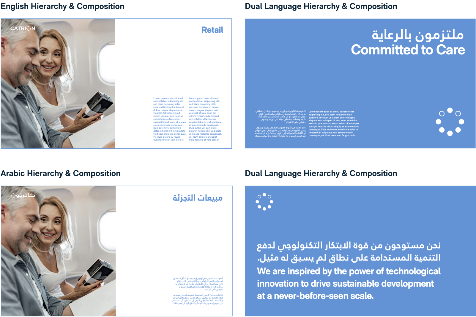
The following examples depict how we utilize the relationship of type in different languages. The following examples showcase how the hierarchy and composition is applied to single language and dual language formats and how it functions with imagery, graphic elements, and the brandmark lockups.
System Fonts
System fonts have been selected for use only when RM Neue and Janna LT are not available. To reflect the characteristics of the Arabic font, Tahoma is a sans serif system font that will be presented in bold and regular, paired with Arial that captures the same essence of the RM Neue type. The dual language font is accessible to both Mac and Windows.
Examples of this can be seen in assets such as the PowerPoint templates, or Word Document templates or Email Signatures.
Arial Bold
Aa Bb Cc Dd Ee Ff Gg Hh Ii Jj Kk
Ll Mm Nn Oo Pp Qq Rr Ss Tt Uu
Vv Xx Yy Zz
Tahoma Bold
ا ب ت ث ج ح خ د ذ ر ز س ش ص ض ط ظ ع غ ف ق ك ل م ن ه و ي ء
Arial Regular
Aa Bb Cc Dd Ee Ff Gg Hh Ii Jj Kk
Ll Mm Nn Oo Pp Qq Rr Ss Tt Uu
Vv Xx Yy Zz
Tahoma Regular
ا ب ت ث ج ح خ د ذ ر ز س ش ص ض ط ظ ع غ ف ق ك ل م ن ه و ي ء
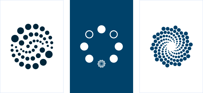
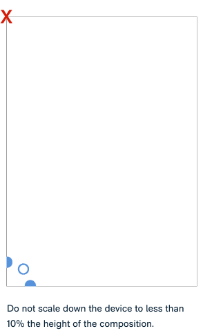
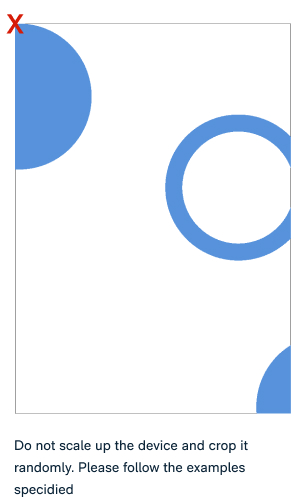
The following graphic devices must be used with consideration and care. Please ensure that the devices are used in a harmonious way, diversifying the use of the following devices across assets to create variety. This is applicable to different collaterals such as PowerPoint presentations, posters, social media posts etc.
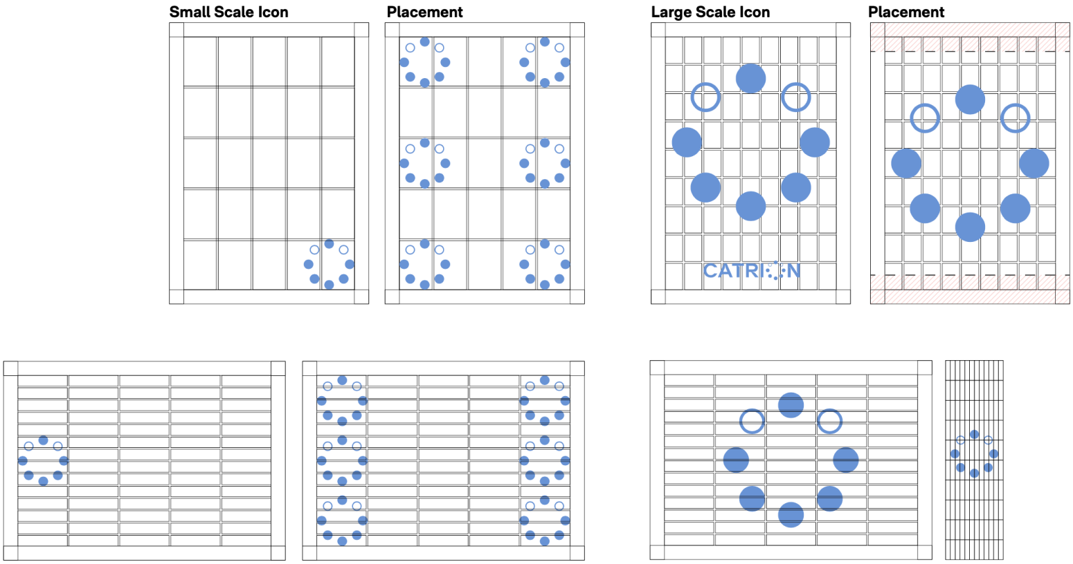
The brand icon will also be used as a graphic device. The devices are applicable to both portrait and landscape formats.
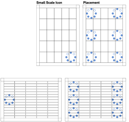
Small Scale Icon The following examples demonstrate how the icon is used in isolation. The placement of the icon is determined by the language wherein the icon is placed on the opposite side of the alignment of the language.
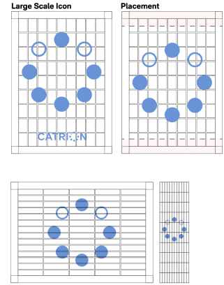
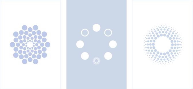
Large Scale Icon The icon will also be used as a hero element of a composition. It will be positioned as per the following examples or center aligned across any page. Ensure there is ample space to accommodate copy.
Please see the Applications section for examples on how the graphic devices will be used.
Graphic Device
Large Scale Icons
Overview
The secondary tier applies the secondar colors in the use of the icon. The use of secondary colors will be prominent in assets created for social media posts, digital banners and printed collateral for employees. Please see the Applications section for examples on how the graphic devices will be used.
Masterbrand
Secondary
Tertiary
Tertiary
Graphic Device
Secondary Tier
The secondary tier applies the secondar colors in the use of the icon. The use of secondary colors will be prominent in assets created for social media posts, digital banners and printed collateral for employees. Please see the Applications section for examples on how the graphic devices will be used.
Graphic Device
Secondary Tier
The special mark will be used as a graphic device. The device will be used for different assets including stationery and digital banners. The tertiary graphic device will only be used upon the CEO approval. Please see the Applications section for examples on how the graphic devices will be used.
Graphic Device
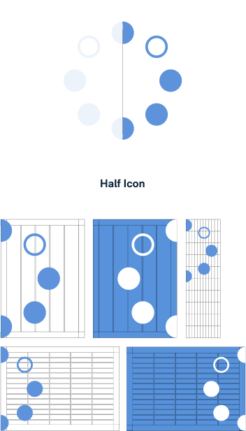
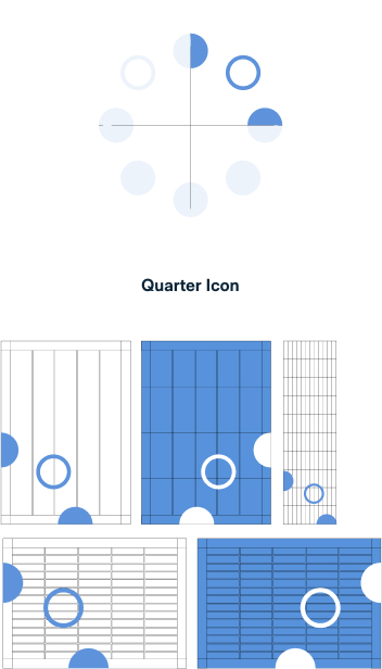
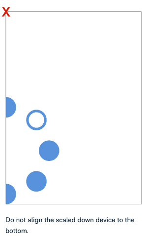
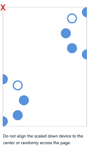
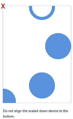
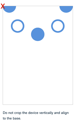
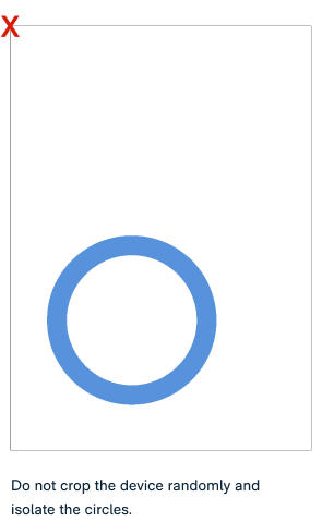
Cropped Icon
The elements will also be cropped and used in different compositions.
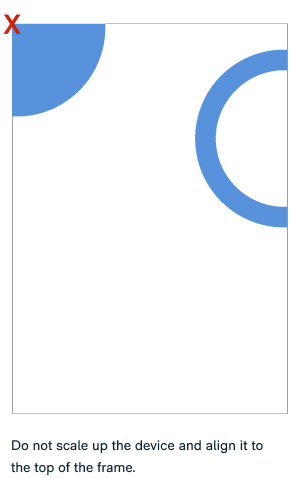
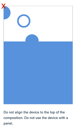
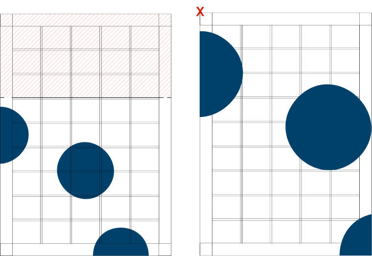
Half Icon The icon will be used full bleed when it is cropped in half horizontally. This is applicable to portrait and landscape compositions. Do not position the icon in other positions than the demonstrated examples. For extreme narrow formats, the graphic device will be aligned to the top of the composition.
Quarter Icon The quarter icon will be cropped and positioned to align to the edge and base of any composition. This can be aligned to the edge of the left or right and bottom of the page. Ensure that it is not cropped beyond the example demonstrated. For extreme narrow formats, the device will be aligned to the edge of the composition.
Please see the Applications section for examples on how the graphic devices will be used.
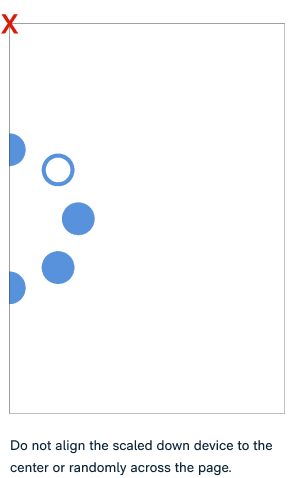
Cropped Icon - Don’ts
Half Icon
Half Icon
Graphic Device
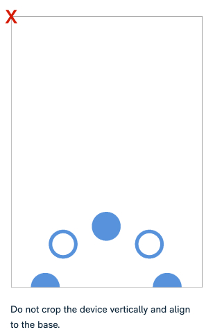
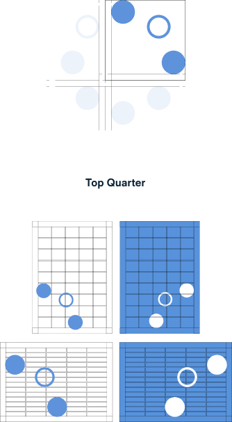
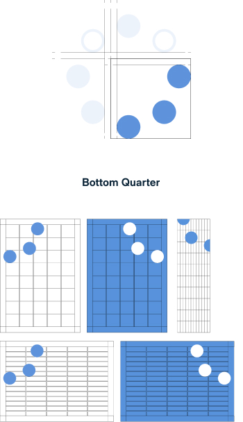
Isolated Icon
The elements will also be cropped and used in different compositions. When the icon is aligned to the top of the format, it will use the bottom section of the brand icon. When the icon is aligned to the bottom of a format, the element will use the top section of the icon.
Top Quarter This element is determined by using three dots from the top quarter of the icon without cropping the circles.
Bottom Quarter The icon will be cropped to highlight the bottom quarter. This can be aligned to the edge of the left or right and top of the page. Ensure that it is not cropped beyond the example demonstrated.
Please see the Applications section for examples on how the graphic devices will be used.
Graphic Device
Circles
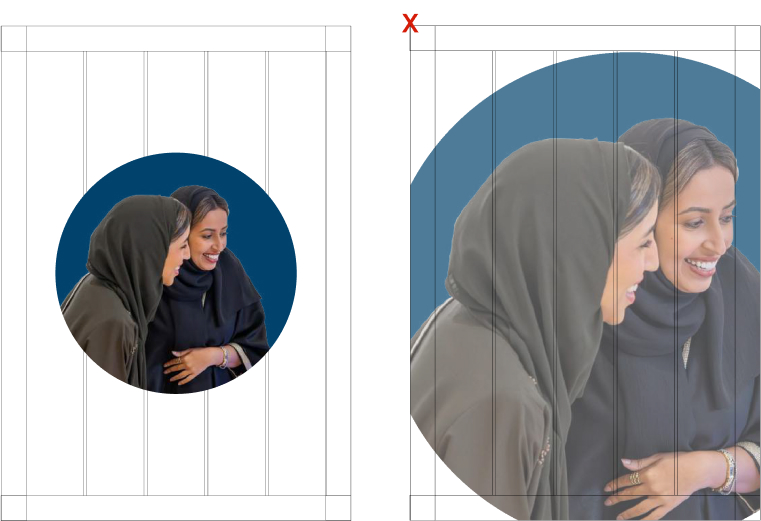
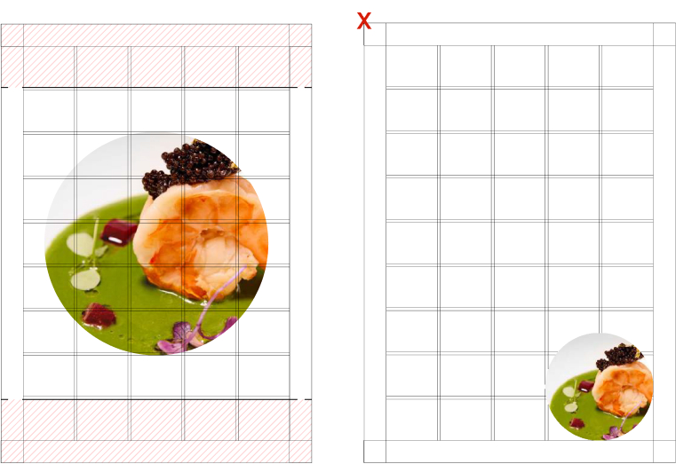
For secondary assets, the circle shape is utilized as a graphic device.
Circle Graphic A single circle element will be used in photography with an opacity of 70% for the sea blue color to highlight a subject matter. Only use the secondary colors at all times.
Secondary Cropped Device Taking inspiration from the icon, the secondary cropped graphic device will feature three solid circles presented with 70% opacity. This will only use the pistachio and sea blue color at all times.
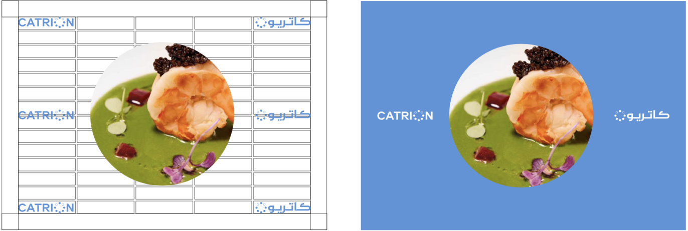
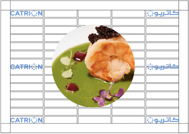
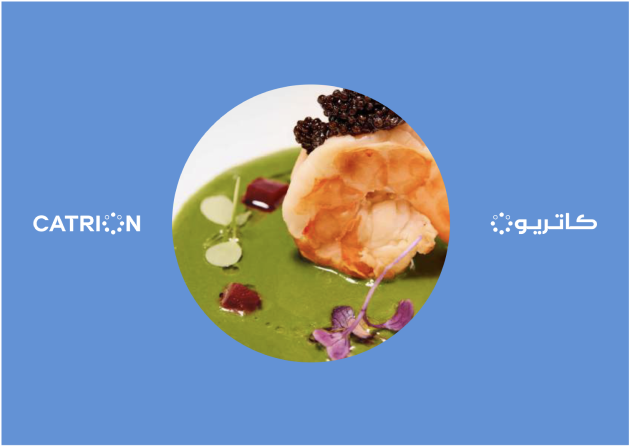
Circle Frame The circle frame will be used to house imagery. This will be placed on a solid colored background in the center of the composition. The circle frame will accommodate 75% of the height of the composition to enable ample space in the background to feature copy. This treatment is applicable to the primary, secondary and tertiary levels of communication.
Please see the Applications section for examples on how the graphic devices will be used.
The special use mark is a tertiary tier use that is reserved for collaterals designed for specific events and occasions. The following must only be used upon CEO approval.
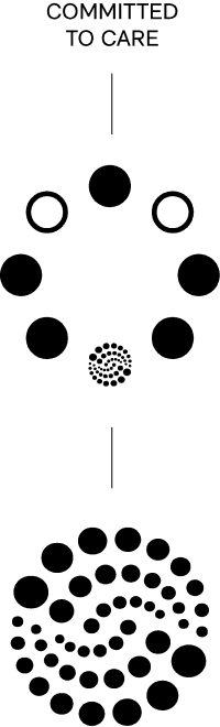
Our brandmark has the versatility
to be dynamic and
adapt to various contexts.
We have crafted bespoke elements that serve as visual representations of our brand values. Each value is assigned its own distinctive element, which can be utilized to communicate and highlight specific values during events or campaigns. These special use marks are exclusively reserved for use as icons and are not to be incorporated into the word mark.
By employing these unique marks, we effectively convey the essence of our brand values and create impactful visual representations that resonate with our audience. The minimum size of the special mark must be atleast 11mm for print and 75px for digital collateral to ensure that the elements have ample visibility.
It is essential to recognize the inseparable connection between each special use mark and its associated value.
These two elements work hand in hand to communicate and reinforce our brand values effectively. As a crucial aspect of our visual identity, we can utilize our secondary colors to enhance the representation of the brand values in our communications.
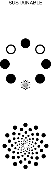
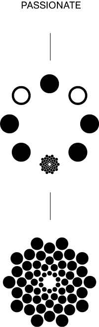
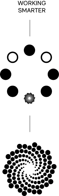
These are examples of how each
brand value is developed and utilized
as an icon.
These examples demonstrate how our bespoke elements are employed to represent and showcase our brand values.
Choose Options
Please select options to download the logo you want.
Choose Options
Please select options to download the graphic devices you want.
Choose Options
Please select options to download the logo you want.


